
Overview
AMG builds some of the fastest cars in the world. Before this project, booking a service for one took 48 hours and a chain of emails.
Owners used to precision engineering in every part of driving were dealing with a manual, inconsistent, error-prone service process. The brief was to close that gap: build a digital service platform that matched the standard of the cars it supported.
I led the UI/UX design across a six-month engagement and delivered a responsive web portal integrated directly with Mercedes-Benz global infrastructure.

The problem
Every booking started with an email. Photos of issues were sent manually. Confirmation required a callback. Parts and pricing could not be quoted without a consultation. Service history was entered by hand, which meant errors. Customers had no visibility into what a Protection Plan would cost until someone called them back to explain it.
The average time to confirm a single appointment was 48 hours. For a brand built on performance, that was the wrong experience to deliver. Beyond being slow, the process was eroding trust with the customers who expected the most.
Survey research with existing AMG owners made the stakes concrete. 70% felt frustrated by the lack of transparency around Protection Plan costs. Most wanted to book on the go, during a commute or between meetings, not from a desk while waiting for a callback. And they wanted to see what was being fixed instead of parsing a technical description written for mechanics.
My role
Lead UI/UX designer, end to end. I ran the discovery research, defined the information architecture, designed the interface, and worked directly with the development team to make sure the frontend integrated correctly with three backend systems: the Mercedes-Benz Global database, the workshop calendar API, and the Protection Plan pricing logic.
The technical integration was central to the UX decisions, and I was in those conversations from day one.
The approach
The research gave this project three non-negotiables: cost transparency, access from a phone, and a way for owners to show what was wrong instead of describing it. Every decision below traces back to one of those three. Before designing a single screen, I mapped the full service journey with engineering and business stakeholders, agreed on which manual steps the backend could eliminate, and sequenced the work so the riskiest integrations were validated first. That alignment took time upfront and saved months later.
Discovery before design
I ran a structured survey with AMG owners before touching the interface. The findings shaped everything that followed and surfaced the three priorities above. They were not wishlist items. They were the difference between the old experience and one owners would actually trust.
Personas
I grouped the research into five owner profiles based on behavior rather than demographics:
Personas
01
The returning owner
Knows the workshop, expects the system to know them back. Zero tolerance for re-entering data the brand already has.
Personas
02
The first-time owner
New to AMG service, unsure what anything costs. Needs orientation and reassurance, not a wall of options.
Personas
03
The on-the-go booker
Books from a phone during a commute or between meetings. Needs the entire flow to work one-handed in under a few minutes.
Personas
04
The plan evaluator
Comparing Protection Plans, currently forced into a sales call just to see a price. Needs the numbers upfront.
Personas
05
The fault reporter
Has a specific problem, often a noise or a mark they can point to. Needs a way to show it, not write an essay about it.

Mapping the journey
Each of the five profiles got a documented flow from sign-in to confirmation, including decision points, failure states, and the system events behind each step. Mapping the flows side by side exposed exactly where the experience broke. Failed authentication on mobile had no recovery path. Plan pricing appeared too late to influence the decision. Issue reporting relied on a generic upload prompt that owners skipped. Each pain point on the map became a design requirement, and the emotional curve across the journey gave stakeholders a shared picture of where trust was being lost and where the new platform would win it back.
The survey data was the input. The journey map turned it into decisions.
The map stayed in use after discovery. When photo uploads underperformed post-launch, this is where we diagnosed it: the flow was asking owners to translate a physical problem into a file attachment. The interactive car map came directly out of that reading.

Progressive disclosure for a complex flow
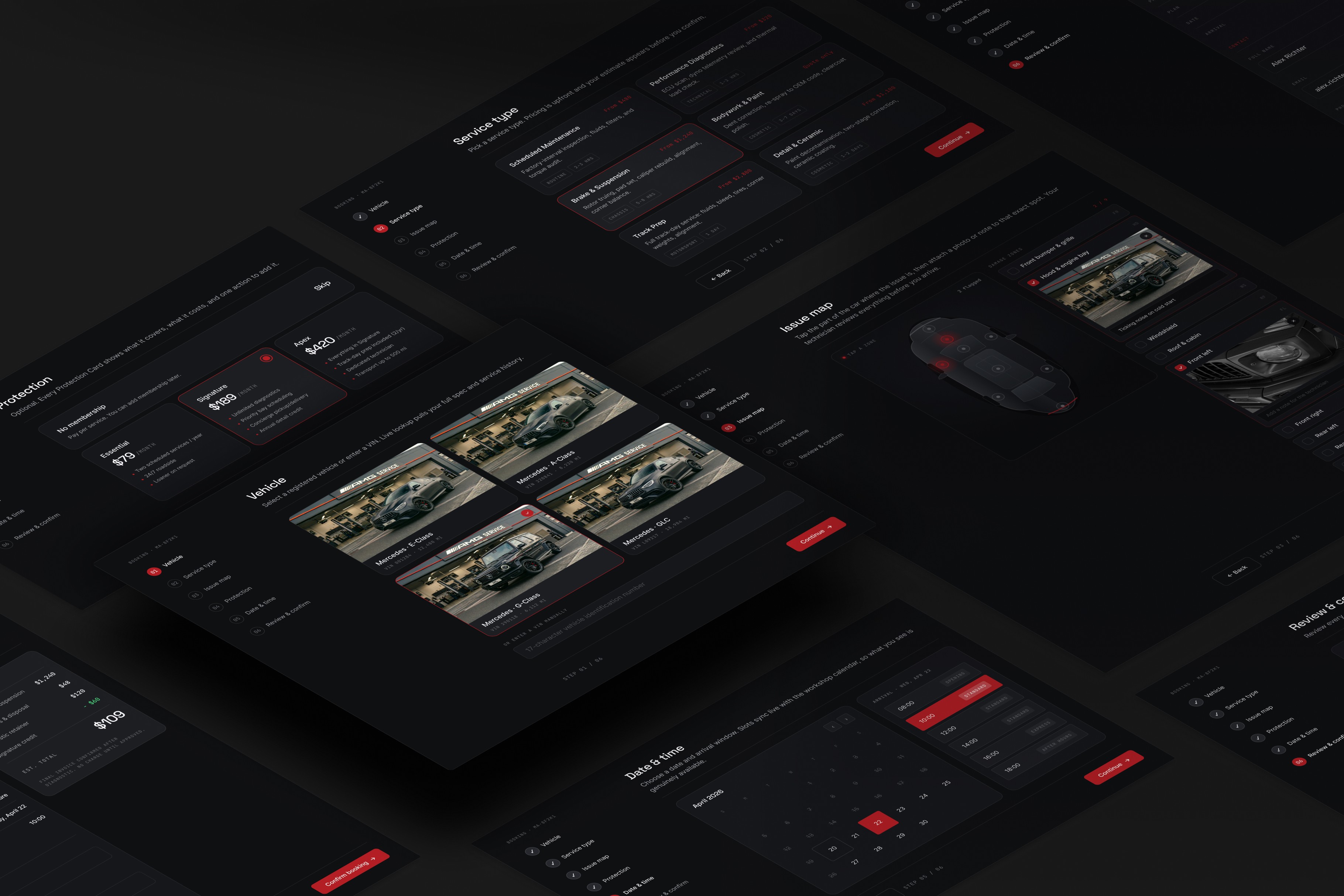
The booking process has a lot of moving parts: vehicle identification, service selection, issue reporting, Protection Plan options, scheduling, and confirmation. Putting all of that on one screen would have been overwhelming and would have increased drop-off. I broke it into a sequential six-step wizard where each step asks for one decision, confirms it, and moves forward. Owners complete the entire flow in minutes, from any device.
Protection Plans as products
The previous process required a consultation just to understand what a Protection Plan covered and what it cost. We replaced that with visual Protection Cards: each plan presented with what it covers, what it costs, and a single action to add it. Complex legal products, treated like retail items. The transparency owners told us was missing became the default state of the interface.
The Visual Garage
The dashboard is built around the owner's specific car, not a generic vehicle form. Using live VIN lookup against the Mercedes-Benz Global database, the system pulls the car's full spec and service history the moment the owner logs in. Their AMG model is rendered in the dashboard with its current health status, upcoming service milestones, and any outstanding items.
Technical integration as a UX decision
Every piece of backend work served a specific user-facing outcome. The VIN lookup removed manual data entry. The real-time calendar sync removed double-bookings. The dynamic pricing engine removed hidden costs. I worked with developers to map each integration to the experience it enabled and designed the interface around what the backend could reliably deliver.
The pivot
After launch, one part of the interface was not performing as expected. The photo upload section, where owners could document a car issue before their appointment, was being skipped. The flow felt too technical and too far removed from the actual problem the owner was trying to describe.
We replaced it with an interactive car map. Instead of a generic file upload prompt, owners tap the relevant part of a digital representation of their car, such as the front left wheel or the rear bumper, and attach a photo or note directly to that location. The mechanic receiving the booking sees exactly where the issue is and what the owner documented.
The change increased data accuracy for the workshop team by 25%.


Key decisions
Four decisions carried most of the weight in this project. Each one traded short-term convenience for long-term clarity, and each one had to be argued for with engineering, business stakeholders, or both. These are the calls I would defend the same way today.
Multi-step over single form
The instinct with complex processes is to put everything in one place. The better move is to understand which decisions the user actually needs to make and sequence them so each one is clear. The wizard structure cut booking time from 15 minutes on the phone to under 3 minutes on screen.
VIN-first personalization
Starting from the vehicle's real data instead of asking owners to fill in their car's details eliminated an entire category of error and made the interface feel relevant from the first interaction. The database integration was the foundation of the personalization, not a technical feature bolted on.
Protection Plans are legally dense. Presenting them as visual cards with clear pricing changed the conversion rate. When people can understand what they are buying, they buy it. The 30% uplift in plan uptake came from design clarity alone. The plans themselves never changed.
The interactive car map
The photo upload pivot is a small design change with outsized impact. The original flow was not wrong, it just was not native to how owners think about their cars. Letting them point to the problem instead of describing it removed the translation step entirely, and the workshop team felt the difference immediately.

Outcome
The platform shipped within the six-month timeline and changed how AMG owners interact with service from the first week. What had required 48 hours of email back-and-forth now takes under three minutes on a phone. Owners see full costs before they confirm. The workshop receives better, more accurate information with every appointment request.
Mobile went from an afterthought to the primary channel: 65% of bookings now happen on a phone, up from 15%. Manual data entry errors dropped from 12% to under 1%.

Appointment confirmation,
down from 48 hours
Customer satisfaction,
up from 6.2
Protection
Plan uptake
METRIC 1
Instant - Appointment confirmation, down from 48 hours
Real-time workshop calendar sync replaced the email-and-callback chain. Owners choose a slot and it is confirmed on the spot, with no human in the loop.
METRIC 2
9.4/10 customer satisfaction, up from 6.2
Measured through post-service CSAT surveys before and after launch. The largest gains came from cost transparency and the speed of booking.
METRIC 3
+32% protection Plan uptake
Presenting plans as visual Protection Cards with upfront pricing lifted conversion by 32%, with no change to the plans themselves. Clarity did the selling.
Retrospection
Three things I would do differently today:
Test the photo upload before launch, not after
The pivot worked, but it cost a release cycle that a half-day usability session with five owners would almost certainly have prevented. The signal was cheap to get and we paid full price for skipping it.
They were the consumers of every piece of booking data, and their feedback is what quantified the accuracy problem. Involving them in week one instead of post-launch would have surfaced the issue-reporting weakness while it was still a sketch.
Instrument the funnel from day one
We learned about the upload drop-off through workshop complaints rather than analytics. Per-step funnel data was added later and immediately became the fastest way to find problems. It should have shipped with the first release.