
Overview
SX Creators is a platform where content creators upload, publish, and monetize their work; members watch that content on sex.com. The product was growing fast, but the team was building without a shared foundation. Every feature shipped with slightly different decisions behind it: inconsistent spacing, conflicting component behavior, no single source of truth for development.
My task was to build a design system from the ground up: Figma library, Storybook catalog, and Confluence documentation as one system, built so the entire team could rely on it from the first component.
Unlike a legacy consolidation, this was a clean-slate build: the challenge was not untangling history but making foundational decisions fast enough to keep pace with a product already shipping.

The problem
Design and engineering were working in parallel but not in sync. Designers were solving the same UI problems from scratch on every feature. Engineers were implementing components without a canonical reference, which meant what shipped rarely matched what was designed, and edge cases were handled differently across the product.
The result was visible: design inconsistencies across screens, slow design-to-development handoff, and a product that didn't feel like one coherent experience. Every sprint carried debt from the one before it.
My role
I owned the design system end to end: strategy, architecture, execution, and adoption. That meant defining the foundation layer, building the Figma component library, establishing the Storybook component catalog, and structuring the Confluence documentation space.
I worked closely with engineers throughout, but the design system direction, structure, and quality bar were mine to set and maintain.


The foundation layer
Every design decision starts with a token. I built the full foundation layer before any components existed: color, typography, spacing, and grid, all defined as variables so a single update propagates across Figma and code simultaneously.
The color system covers a full palette: Pink, Blue, Neutral, each running from 50 to 900, plus decorative colors, semantic status colors, and a brand gradient. Typography runs from Display 1 through Caption, built on a 4px grid system with defined sizes, line heights, and weights for every level of the hierarchy. Spacing and radius follow the same token logic. There are no hardcoded values anywhere in the library, which means a rebrand or visual refresh becomes a token update, not a rebuild.
Components built for coverage, not decoration
Components are assembled from the foundation layer, never from raw values. Buttons alone cover five sizes from extra small (24px) to extra large (56px), four visual styles, and every interactive state (default, hover, focused, disabled) in both light and dark mode. Every component was built with auto layout throughout, a breakpoint switcher for responsive preview, variants and properties for every state, and full dark and light mode support from day one. Inputs span standard fields, text areas, and verification inputs with complete error-state handling.
Patterns bring components together into reusable surface-level solutions: headers, navigation for both desktop and mobile, and footers each serving creator and studio roles without requiring separate implementations.
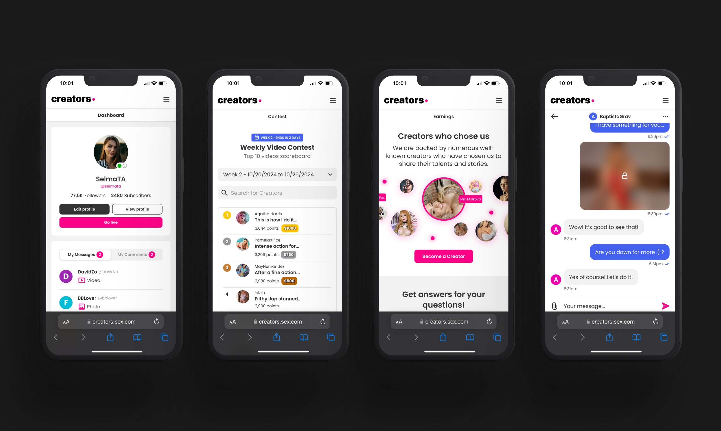
Storybook as the engineering bridge
Every component designed in Figma had a corresponding story in Storybook. Story-driven development meant engineers could see every state, test every variant, and implement components without needing to chase the designer for clarification. Token system integration ensured that CSS variables pulled directly from the same source as Figma. No translation layer, no drift.
Documentation as a product
The Confluence space was structured from the start like a product: something the team would actually use, not a document they would file away. Every component page covers anatomy with labeled diagrams, usage guidelines with do's and don'ts, accessibility considerations, and responsiveness notes. New engineers and designers joining the team could get oriented and start contributing without needing to ask anyone.


Governance and contribution
The system also shipped with rules for changing it. Component proposals go through a review step, releases are versioned, and the documentation defines who can contribute and how. A design system without governance is a library that decays; this one was built to be maintained.
Accessibility as a baseline
Accessibility was built into the foundation, not audited at the end. Every color pairing in the token layer passes WCAG contrast requirements, focus states are defined on every interactive component, and the documentation records the expected keyboard behavior for each pattern. Compliance is inherited from the system, so teams get it by default instead of checking for it feature by feature.


Key decisions
The system's durability came from a handful of early calls, choices about architecture and working practice that were harder to make than any single component, and that determined how the system would hold up as the product grew.
Tokens over hardcoded values
Building everything on tokens made the system theme-able and resilient to change. New surfaces inherit the visual language instead of reinterpreting it.
Dark and light mode from day one
Rather than retrofitting a dark theme after the fact, I built both modes into the component architecture from the beginning. Every component in the library works in both contexts without modification.
One unified library
I kept the Figma library consolidated rather than splitting it by product area. The short-term complexity of maintaining one larger library is worth the long-term coherence of one library every designer
works from.
Full state coverage at handoff
No component left Figma without every interactive state defined. Default, hover, focused, disabled, error, loading. Engineers should never need to invent a state that wasn't designed.

Outcome
The design system became what I set out to build: a single source of truth the whole team builds from. Feature work starts from the library instead of a blank canvas. Engineers implement against Storybook stories rather than interpreting mockups. Onboarding new team members became a structured process rather than an oral tradition.
Adoption was the real test. After launch, new feature work moved onto the system without a mandate, because starting from the library was faster than starting from scratch. That is the outcome a design system exists for: being used because it wins on merit.
47%
Faster work process across
design and development
88%
Reduction in design inconsistencies
across the product
93%
of new features built
from the system
METRIC 1
47% faster work process
Measured through an internal survey of designers and engineers after the system launched. Teams reported that shared tokens and reusable components cut feature design and build time roughly in half, work that previously started from a blank canvas now starts from the library.
METRIC 2
88% reduction in design inconsistencies
From the same post-launch survey: the team assessed consistency across the product before and after adoption. With every screen assembled from one component set and every value pulled from tokens, the spacing, color, and behavior drift that defined the old product was nearly eliminated.
METRIC 3
93% of new features built from the system
Within two quarters of launch, every new feature shipped by the product team was assembled from library components. No team requested an exemption and no parallel component sets emerged.
Retrospection
Three things I would do differently today:
Introduce Storybook earlier
Design ran ahead of code in the first weeks, and the gap showed. The system only started compounding in value once all three layers moved together, with every component landing in Figma, Storybook, and Confluence as one motion. I would set that rhythm from the first component, not discover it midway.
Documentation closed the loop after components landed in code, which meant early adopters worked without a reference and asked the questions the docs would later answer. Writing each page alongside the component would have caught unclear naming sooner and made the library self-serve from day one.
Validate against a live feature sooner
The foundation layer was built before any real feature consumed it, on the logic that foundations come first. A pilot feature in the first weeks would have pressure-tested the tokens and component APIs against real product needs earlier, and a few late restructurings would never have happened.